
Naomi
SAunders

Unit one
Diagnostic Practise
LO1 Context
LO2 research
LO3 Development of creative practice
LO4 problem solving
LO5 planning, process & Production
LO6 evaluation And reflection
LO7 presentIng a creative practice


A
B
C
d
[11]

E
LO2/3
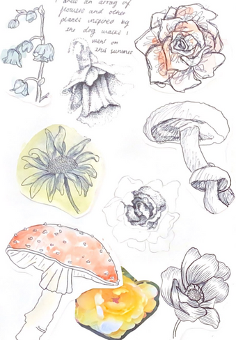
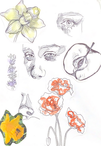
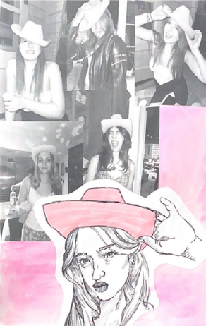
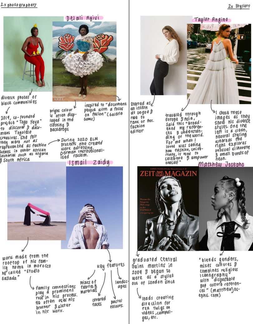
Bic Summer Project
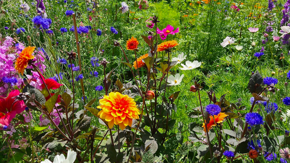
A Sketches of wildlife inspired by dog walks
B Sketches of wildlife & senses inspired by dog walks
C Exquisite corpse style drawing
D Sketches from photos of friends
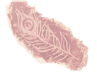
E Peacock feather
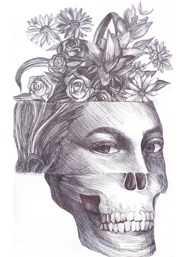
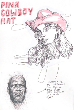
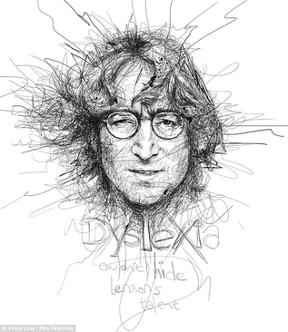
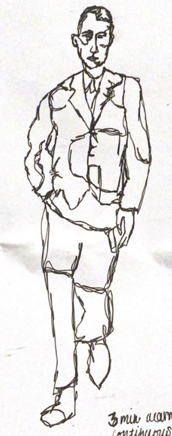
In order to record the experiences of my summer vacations I created a series of biro drawings. In these, I experimented with a range of mark making techniques. These varied from looser continuous line pieces (inspired by the works of artist Vince Low) to pieces made with the biro’s lid and scratched into a ground of oil pastels. Studying the style of certain artists helped me to apply techniques they commonly utilised in my own work. Overall, I feel the range of outcomes helped to reflect the varied emotions I had over this time and in future work I hope to continue to convey this. However if I were to do this task again, I would try more experimental approaches to use up my pen as most of the outcomes are just biro drawings.


LO2/LO6
Materials Research Task
I Recorded different materials around the university building through photography and observational drawing, paying special attention to the facades of buildings and how their aesthetics are often prioritised over functionality; one such example is the Design District Canteen. Made of clear plastic panels, this structure is shaped to resemble a cloud. It was built this way despite requiring more cleaning, specialist measures to avoid vandalism (such as the installation of polycarbonate panels) and issues with regulating the temperature[10]. This may be because the architects believed this facade would attract more patrons.
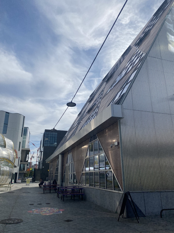
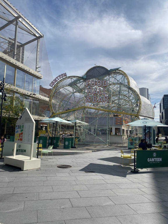
Doing this activity taught me to consider the effects materials have both from on the cosmetic and practical outcomes of projects. For example, the previously mentioned plastic panels is incredibly strong in most cases but not suitable everywhere as it can crack in some environments.
LO4/LO6/LO7
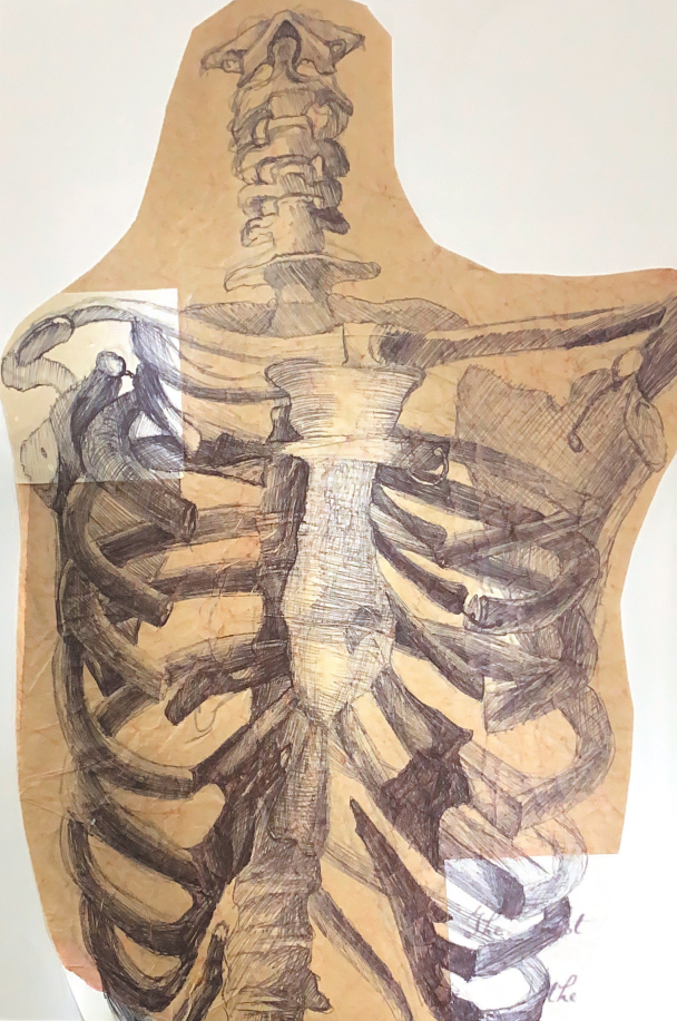
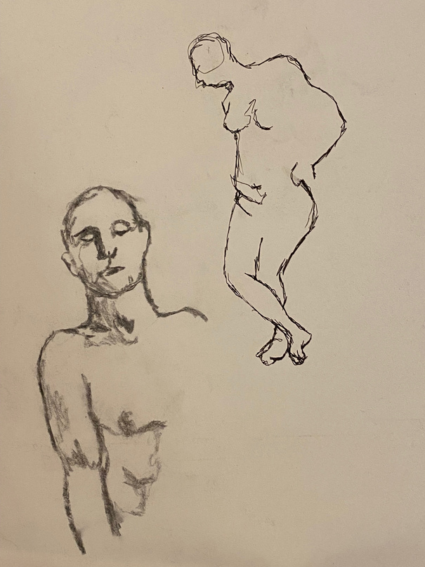
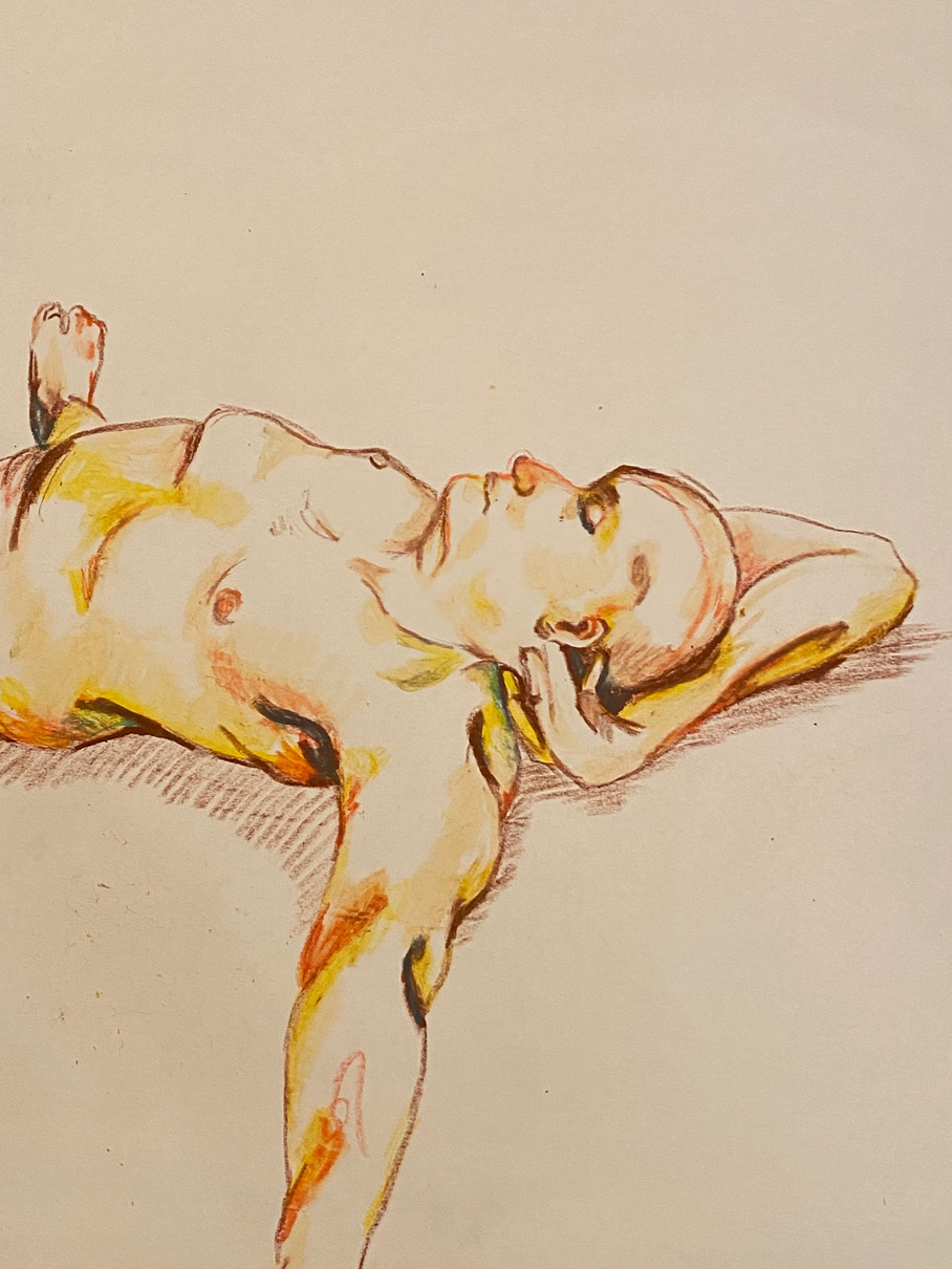
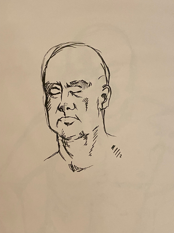
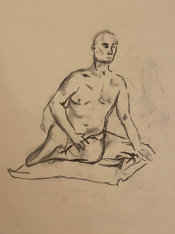
Life Drawing
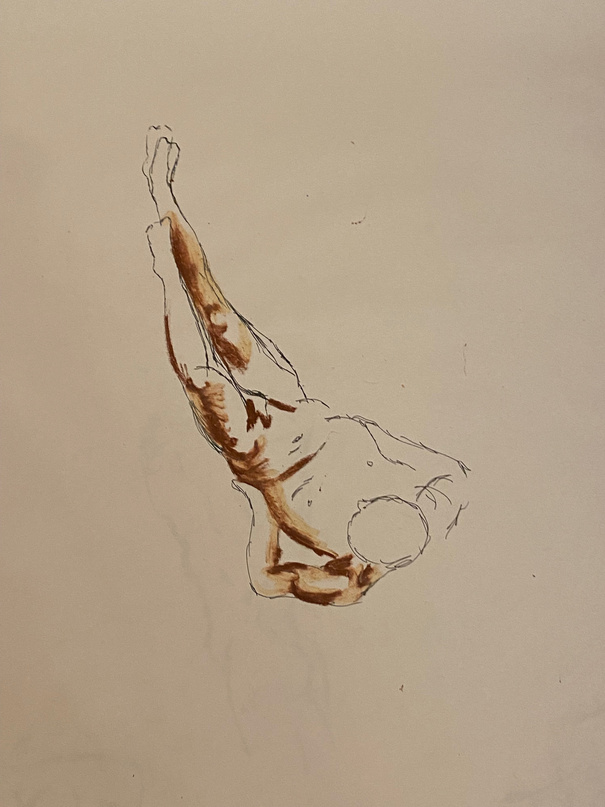
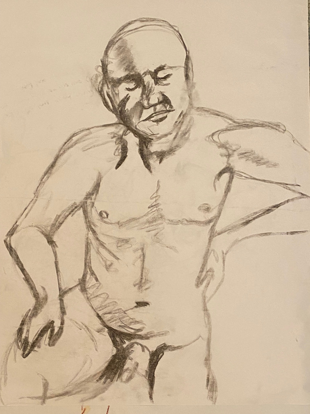
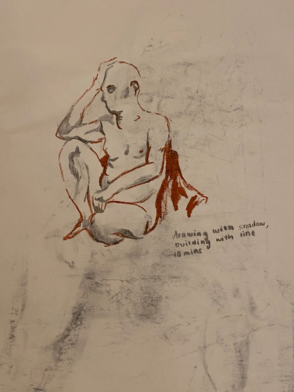
We were introduced to a range of drawing challenges such as starting with only shadows before finishing the piece. These methods made me adapt how I work to create outcomes in ways I may not be experienced in. While initially being a daunting task, by working in this way, I feel I was able to work more freely in some regards. This in turn helped me improve on my drawings as I went through the session, especially proportion and speed. After each drawing, I tried to reflect on the aspects I most liked or wanted to change before the next drawing. This task therefore helped me think in a more critical manner, which will help me improve in evaluating future projects I undergo.
LO4
Photoshop Introduction
We were given an introduction to Adobe apps, especially photoshop where we were taught basic skills such as using layers and different tools. These foundations of the apps will be crucial in future projects where I will be using digital methods. However, I encountered a range of difficulties at first with the app crashing and learning how to use certain aspects. When I next create work on photoshop, I will try to create a mock up first to help refine my skills.
Contextual Studies
[03]

*
Democracy, Protest & Empowerment
LO1/2
Reflective writing activity for Contextual Studies
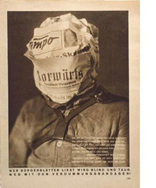
In order to best begin our contextual studies component we were told to find one work related to the prompt “Democracy, Protest & Empowerment”. As such, I looked at graphic design artist John Heartfield. He paid special attention to how his background in graphic design[1] could be used as a tool to protest This links to the themes of democracy and protest best as Heartfield utilised peaceful protest by distributing media[2] such as the poster to the left “Whoever Reads Bourgeois Newspapers Becomes Deaf & Blind: Away with These Stultifying Bandages” (1930). This piece in particular interested me as I liked that, in order to convey his message, the artist used irony as this was published mainly in newspapers. The message of disputing propaganda is linked closely to the idea of a democracy as, in a true democracy, both cannot simultaneously exist as a government’s role is in the true representation of them and not to be blindly followed.

LO
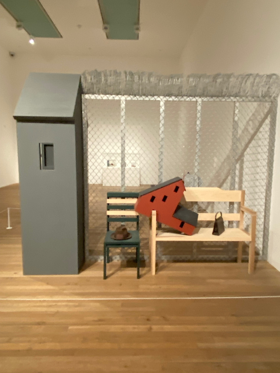
Tate Modern Trip
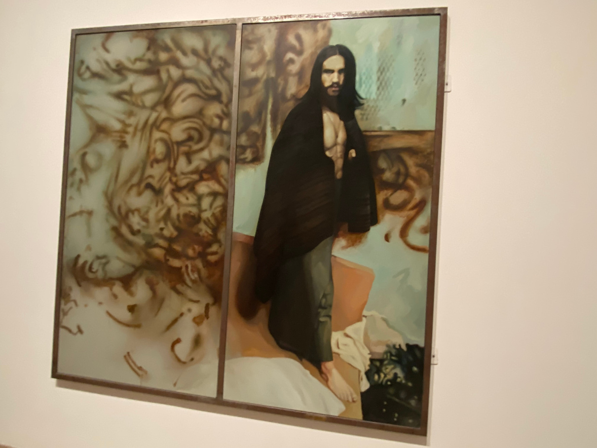
Out of the pieces I saw at the Tate Modern, I was most inspired by “The Citizen”, a part of Richard Hamilton’s series of diptych paintings based on the Troubles in Northern Ireland[8]. This particular work was based off an IRA prisoner protests where imprisoned members of the group demanded they be classed as political rather than criminal. The government refused to change their status and so they resorted to protesting through extreme methods such as rubbing excrement[9] on their prison cells and refusing to wear uniforms. I felt this was a good work to look at as it shows a protest that was undergone when people felt they were being treated undemocratically. This is therefore good to analyse for our set brief. The historical influence of The Troubles in Northern Ireland is also an interesting topic that would allow me to add a great depth of context to my essay.
[06]
[04]


[07]
[05]

Contextual Studies: final 250 words
I believe protesting is an effective way of directly getting involved in democracy between elections. It’s crucial within a democracy as a way of reflecting the views of the people, especially on issues that there’s governmental or corporation complacency. It was said by Philosopher Henry David Thoreau “Disobedience is the true foundation of liberty. The obedient must be slaves”[46]. Protest is being suggested to be freeing, a way of releasing yourself from societal pressure to conform. To me this quote also suggests protests play a great role in creating positive changes to society.
Over the past few years, protests have increasingly infiltrated the news cycle. Pressure groups such as Just Stop Oil have risen to fame through their controversial methods of fighting what they call “corrupt oil”[47]. However, protesting is nothing new. The Troubles was a period of conflict in Northern Ireland that lasted over 30 years[48]. The violence from this era saw many imprisoned, which helped to inspire Richard Hamilton’s “The Citizen”[5]. The paramilitary group the IRA resorted to protesting their criminal status in prisons by rubbing excrement on the walls of their cells. This is referenced in his work with the brown paint strokes. To me, this is clearly trying to evoke disgusted reactions from the viewer as a means of drawing attention to prisoner’s voices. The fact that Hamilton found about these protests in an article shows their success in amplifying this message to the masses. I believe protests role is in educating the public on issues
Fashion Communication
*
Styling & photography based on a character
Fashion Textiles session
LO2/3/5/6
Fashion Photography
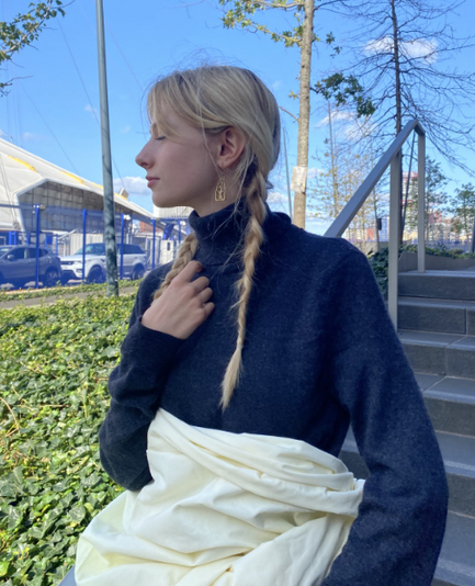
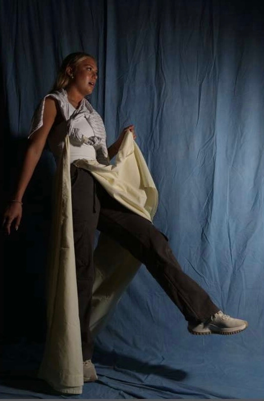
In the first session, my photographs were based off the prompt “Loud”. I started by creating a mood board (pictured below) with a range of requirements such as pictures showing poses, camera angles, etc. This allowed me to create a clear plan of the goal image before shooting. After a small introduction to the cameras, we learnt basic photography skills. For example, I decreased the lens size in order to create a darker outcome. These dark shadows and the contrast of this piece alongside the bold pose of the model help to fill the space. This conveys my theme of loud with the boldness of the photograph.
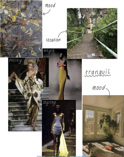
In Contrast, my second set of photos in natural lights conveys a much calmer scene, however the details are less sharp because of the brightness. This did demonstrate “tranquil” well however, many photos details were lost or washed out. In the future, I would make sure to take more time adjusting the brightness of my outcomes so details aren’t lost or think about shooting in different areas as naturally light scenes are harder to consistently light. Overall, these sessions helped me to build basic photography principles that I will use in future works so the images are correctly lit and details aren’t lost.

LOUD
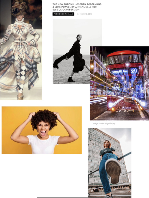
[12]
[13]
TRANQUIL
[14]
LO2
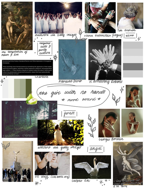
Story research
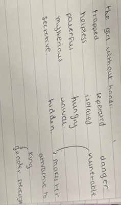
I read the story of The Girl with no hands, a brother’s grim tale.[49] From this, I created a summary of the key plot and characters and posted this on a padlet. Here, we could comment on what others found most interesting from each story
LO1/2
Artist research
[16 & 17]
[18 & 19]
[20 & 21]
[22 & 23]
[15]
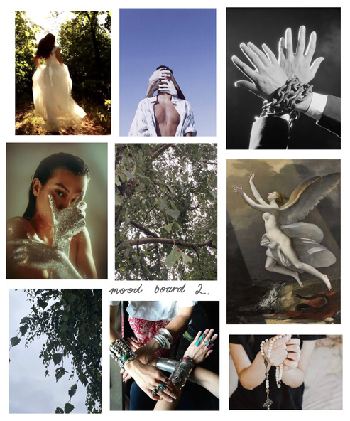
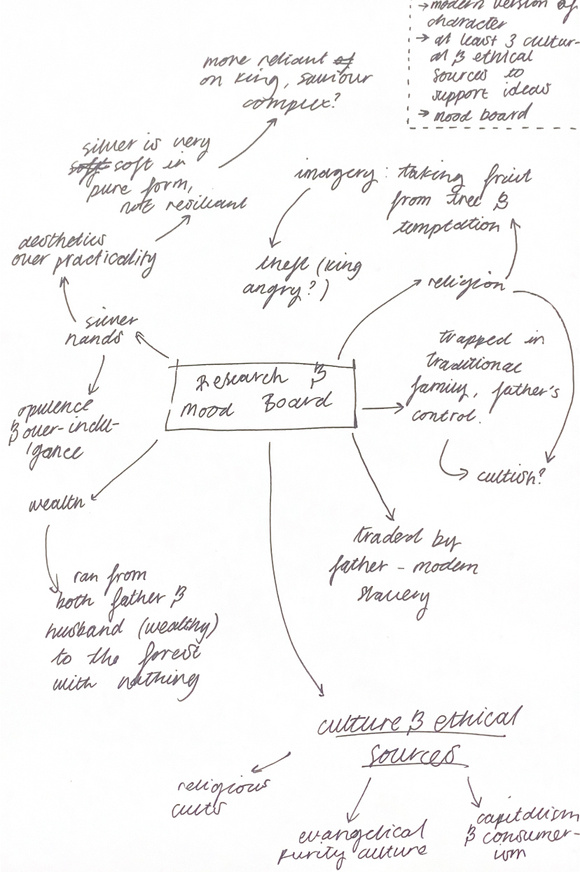
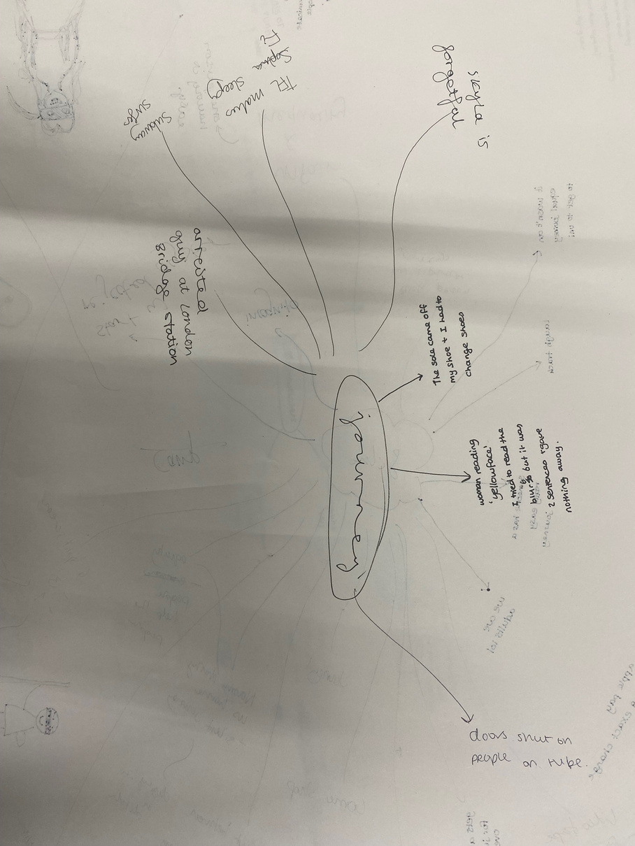
We began this rotation by having our partner list words that came to mind from an initial illustration of this fairytale. From these words I began to consider how I could modernise the story and characters while still upholding the key themes my partner highlighted. I recorded these on the mind-map below, after this I cut down on ideas to create an initial mood board (top left). However, this mind-map was too busy to convey my ideas clearly. I decided to make another, consicer version that conveyed my key ideas clearer (top right)
LO2/4
Found images: Character mood boards
LO2/5
Fashion Communication Deck

Click Through
(Slideshow)
[24 & 25]
LO6/7
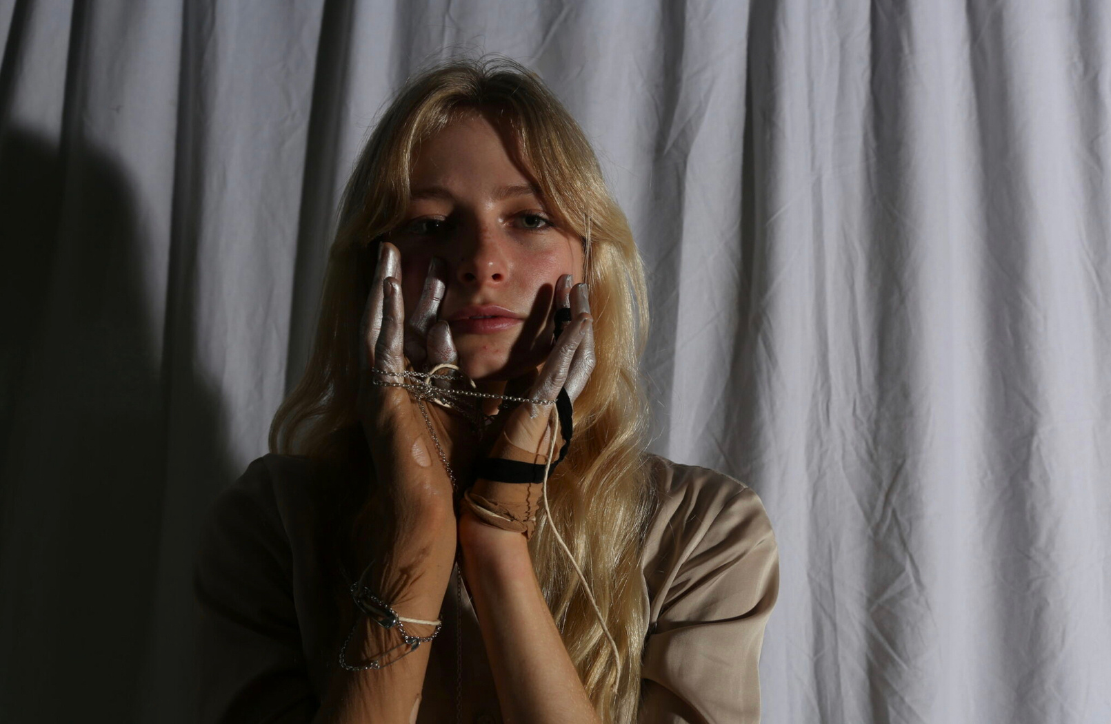
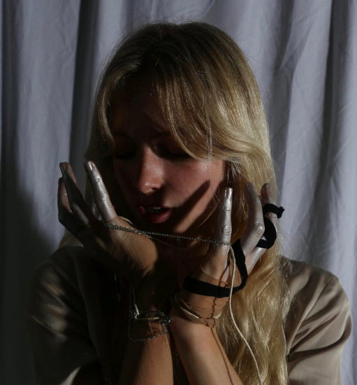
Final Character Photograph
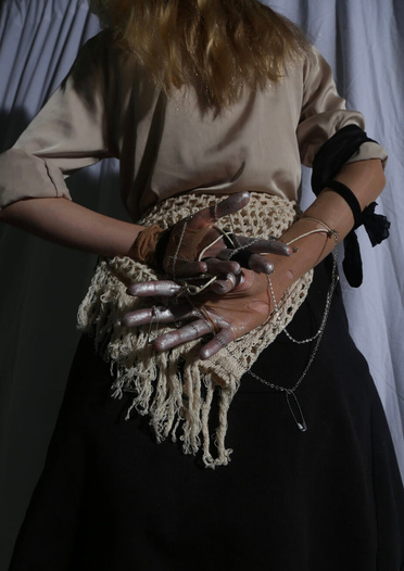
After reflecting on the mock photographs I took, I made slight changes to the styling such as adding a layer of black fabric to help contrast the light colours of the hands and the material around them. This helped to draw attention to the hands as a focal point. I also experimented with using silver paint in these photographs. Overall, I feel these photos were sucessful however, if I redid them, I would try to have slightly more light on the face as, although I like the dramatic shadows, in some photos too much of the model’s features were lost.
LO3/7
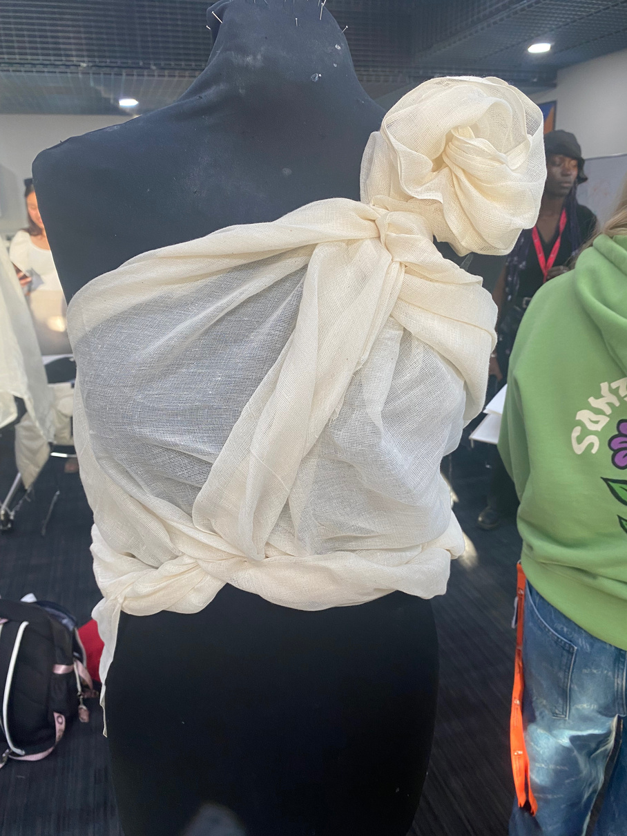
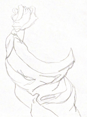
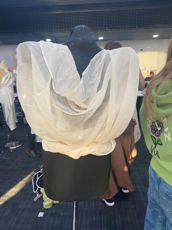
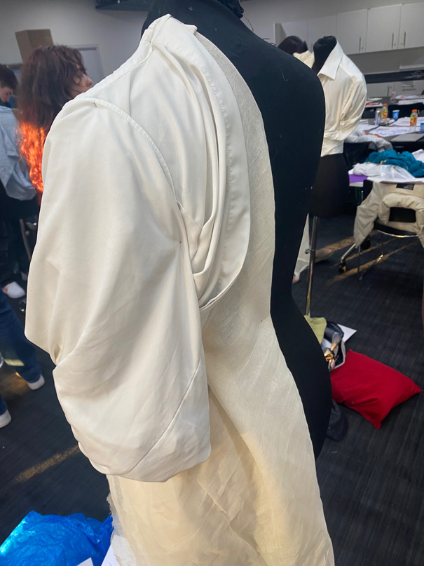
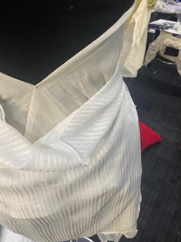
Fashion Textiles: Draping
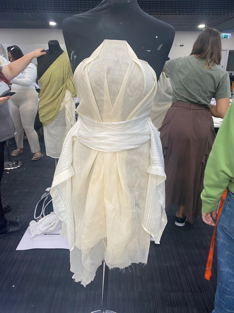
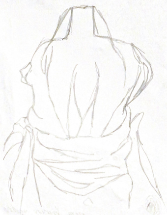
In the final session of the fashion rotation week, we were introduced to fashion textiles processes such as draping. This allowed us to experiment with possible shapes and forms for garments. After each one, I photographed and sketched the outcomes which helped me to record ideas for garments. It also helped me to see shapes or areas I would change or enhance for a better silhouette. I will use the observational skills I practiced here in more of my works as well.

Here I used a pair of washing up gloves to make shoulder pads. By doing this, i started to consider how onjects can be used other than their intended purpose. This links to some of tthe 3D artists I later studies who make “ready made” Art.
LO3/6/7
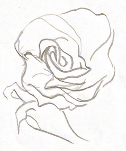
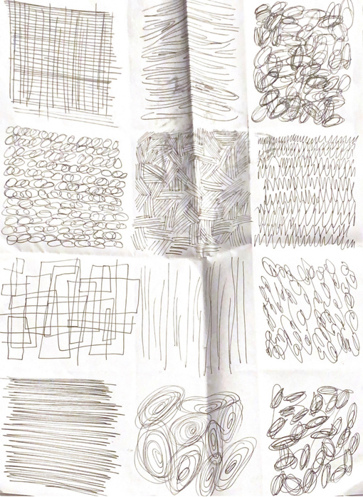
Fashion Textiles: Sketches
To warm up, we began a mark making task, pictured to the left. This meant when we underwent the range of drawing challenges and tasks after this, mark-making was a particular focus of the results. While I feel I utilised a range of mark making in most of the pieces, the continuous line drawings had less. If I did this task again, I would try to include more in these so they look less flat.
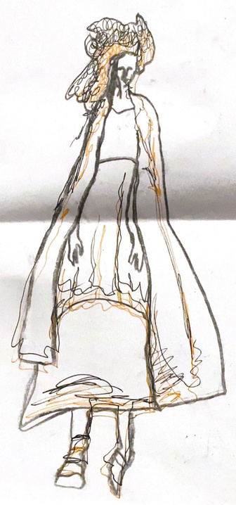
Sketching models’ looks helped me to visualise silhouettes better as well as drawing my attention to the fabrics the designers chose to use. In fashion communication, we were taught to be considerate of how each element of a shoot conveys the stylists ideas, so looking this closely at these images in order to draw them also drew attention to smaller details of a styled outfit.
Sketching is a way of emotively representing a clothing collection, which may help to communicate the designeer’s ideas with potential buyers. This task was helpful as it made me focus on who a collection is designed for. Client demographic is something I need to pay attention to in other projects, especially when designing products or clothing.
Media production
LO1/2
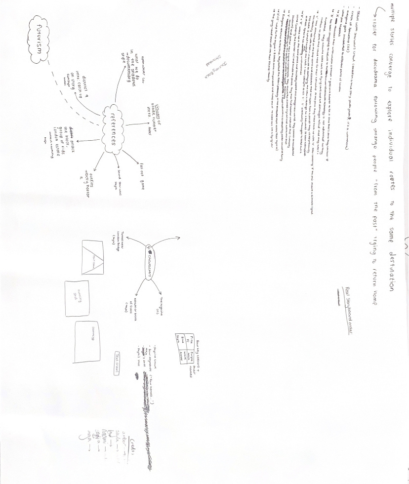
The Brief & References
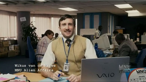
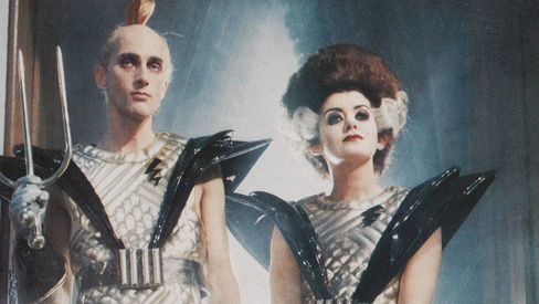
Initially we were told to create a film about the prompt “journey”, we were also told later our group would bemaking a sci-fi film. We interpreted the prompt to be not just a physical journey but also characters going through a range of emotions while progressing towards their final destination. We wanted to do this in a comedic manner that audiences would find enjoyable to watch, which is why we initially looked at District 9 as a reference. We liked that this film was able to comedically criticise social inequality. In our film, we tried to emulate the satirical tone of the film. For example, we over exaggerated aspects of sci-fi films such as costumes and makeup to be even more dramatic, parodying ones we looked at from references such as “Farscape” & “Rocky Horror Picture Show”. We created coned shoulder pads to mimick the some costumes seen in Rocky Horror[28] and created brightly covered makeup with harsh contours as seen in Farscape[27].
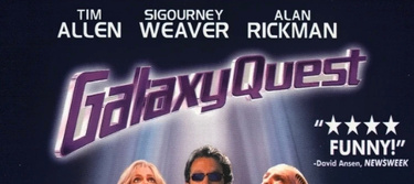
I was also interested in the how the title could reflect the theme, and so I researched different fonts used on sci-fi film’s posters. This is when I looked at Galaxy Quest’s poster as the bold lettering helped to clearly distringuish the genre. From here, we discussed how the film should start with a scene of predominantly text to make the title have a bold impact. Since the title “Stranded” summaries the plot well, we hoped this could act as a means of storytelling and contexts when you watch the following scenes.
*
Sci-Fi film based on the prompt “journey”
27
26
28
LO3/5
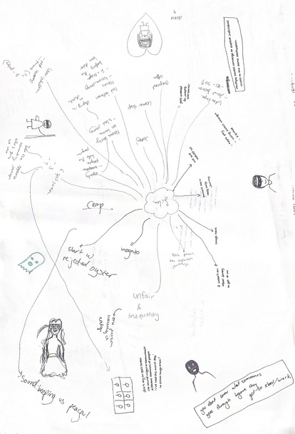
Initial Ideas & Planning
Creative Development
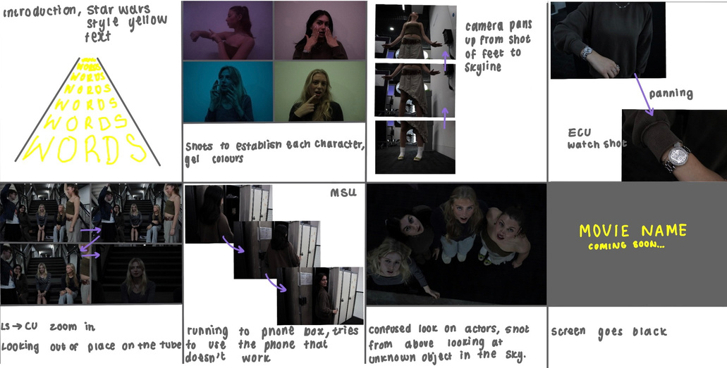
In order to brainstorm ideas within the group we created a series of mind maps. After each one we chose one aspect to expand on the next. This became the foundation of the plot we chose to use in our film. To help keep a clear direction we came up with one summary line for the theme. Then we were told the genre we would be working in was sci-fi. Members of the group split roles effectively, some focusing on costuming, cinematography, etc. I took the role of director in this film, so I began to look at how I wanted each scene to be shot, paying special attention that common filming techniques or events in sci-fi films (such as teleportation) were highlighted. I planned each scene out first on a hand drawn storyboard and then had the actors within the group pose as they would in the scene and photographed this. I put these images on a new story board that helped me to visualise each scene more clearly and also adapt how I imagined each scene to be shot. At this stage, the photography helped us to decide on lighting, changing the angles scenes were shot at and deciding to remove the coloured gels in order to reflect our desired sci-fi aesthetic.
LO1/2
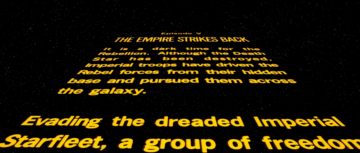
Star Wars Crawl
In order to introduce our film, we wanted to open with an overall plot summary. We wanted to keep this element reflective of our theme, so after discussing options we decided to emulate the opening scenes of the Star Wars films. We chose this as it would be easily recognisable and encourage our viewers to think of a space theme. To achieve the look we replicated the yellow tone of text and a sans-serif font.
LO3/6
Creative Development: Video Editing Session
In the last session of the media production rotation, we were introduced to different editing techniques to make our edits flow more smoothly. One of these was the match cut, which I practiced with the video to the left.
We were introduced to the match cut in the a presentation as part of the video editing session. I then researched into why it is commonly used. It can be a way of making “a discursive alignment between objects”[37] which is a tool to “create visual metaphors in film since the match cut can suggest a relation between two disparate objects”[37]
In the future, I would implement a similar method but with my own videos for both parts rather than using found stock footage of the Earth. The match cut suited this footage well as it helped to transition between two very different scenes. It also created a visual link between the two sets of footage, reminding the viewers of space the next time mirror balls are seen in frame, which helps link plot points well.

Video
Please Play
Animated gif
please watch
29
LO4
In the same session, we were also introduced to rotoscoping. This technique was first used in 1915 by Mar Fleischer [38], its a process where each frame of movement is traced to create an animation. This makes animations that have very realistic movement, which is why it is so common in both traditional animations to in video games.
To try out this method, I took photographs of my eye blinking and drew over these. Initially the animation did not line up well frame by frame. This left the result looking disjointed and unnatural. To remedy this I had to realign the layers. While I think the final result looks quite smooth because of the high amount of frames per second, I feel that adding more frames in between would make it look even smoother. I also think the addition of colour would make this look more impactful.
Overall, our group worked well together to create this final project as each member took on a role and offered their Own influence on creative decisions. As director, I personally am proud of many of the shots as they translated well from my initial sketches to real life. While this aspect went well, if we redid the film I would try to carefully consider where we shot, as I feel the locations we used were not able to accurately portray aspects such as the spaceship we had originally hoped to feature. Within my role as director, I also had trouble shooting some scenes when in the public. The low angle shot of one actor required us to block a path which was not easy in the busy London location we had initially intended to use. To work around this we had to find new areas to shoot, however this didn’t affect our outcome in the end.
LO6/7
Final Group Edit of Film
Video
Please Play
[30]
3D Creative Practice
LO2
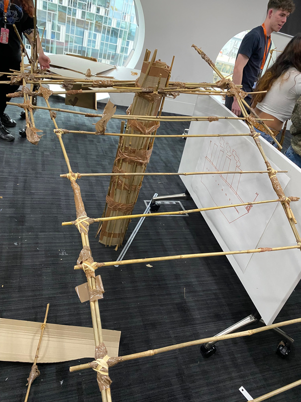
Spanning Structure Task
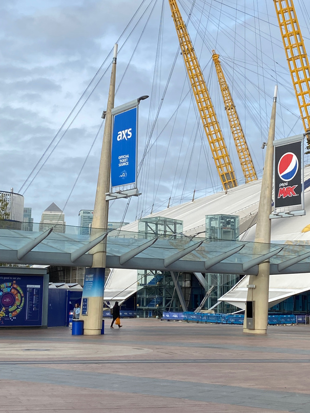
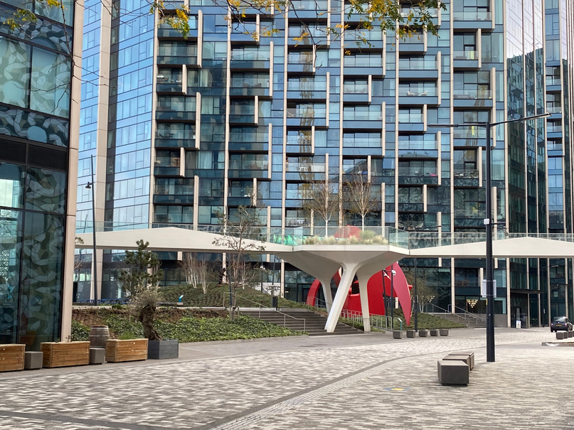
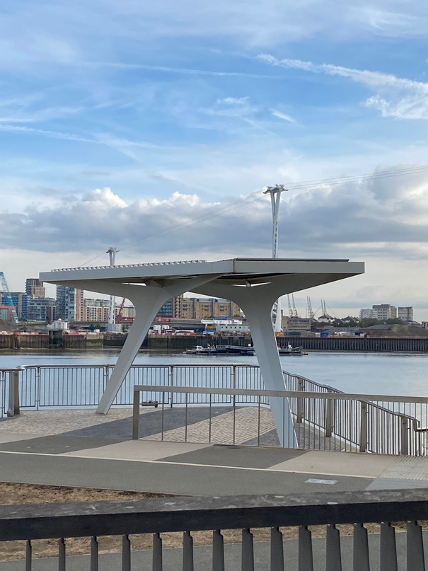
As we began our 3D rotation, one of the tasks we were given was to photograph as many spanning structures as we could in the local area. This helped us to quickly identify how certain design features can be used in a range of different situations. This influenced my bridge design as it drew attention to how structures were made stable with limited supports, something crucial in the later task when we could only have two additional supports to create a bridge.
*
Team bridge building task, creating spaghetti structures & turning 2D drawings into installations
LO5
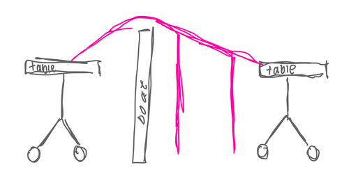
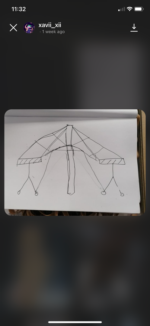
Initial Plans for the Bridge
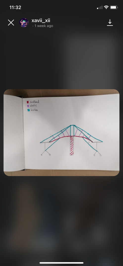
The first task for the 3D rotation weeks was to build a bridge out of cardboard, tape, elastic bands and bamboo rods. It had to be tall enough for a boat to pass under and strong enough to hold a toy car. We were put into groups and we initially all did individual sketches for our plans (top left image), them we came together as a group to discuss the best parts of each of our designs.This resulted in the middle image, which we colour coded the design with which of the materials we intended to use. This helped me to learn how to communicate with a team to create a range of ideas and how to be selective in refining them down to one clear plan, taking the best elements for our discussions.
LO1/6/7
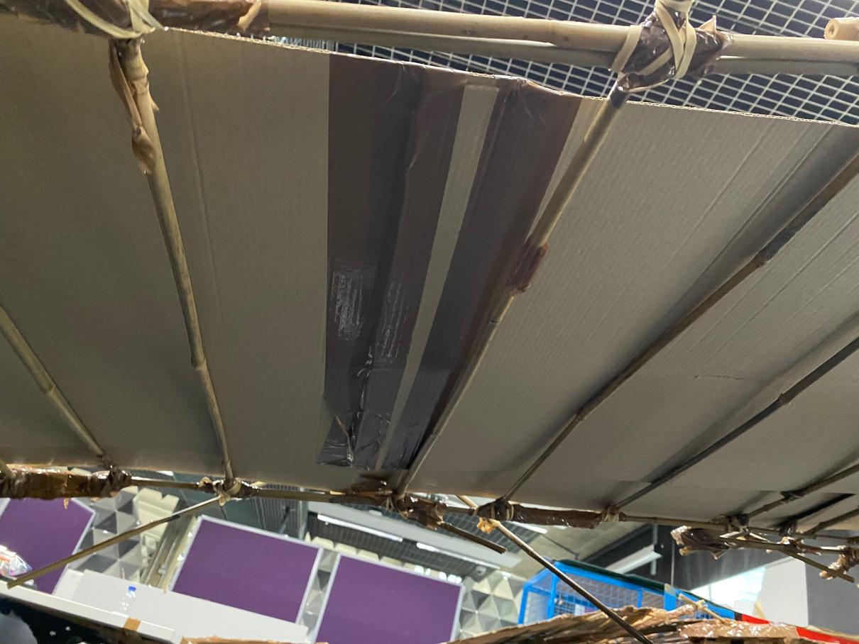
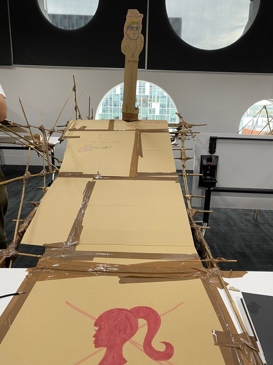
Final Outcome of Bridge
Being given a limited material list made us think outside of the box for what each element could be used for, we initially planned to loop elastic bands together to create ropes. These could’ve been used to create a suspension bridge, where the tension would hold the bridge. However, we moved away from this idea after testing it out as cardboard is hard to reinforce enough to withhold this force.
Our group used large amounts of duct tape to secure bamboo rods together. Reflecting now, I feel that this could have been done with reusable elastic bands instead, which may have created less waste and a cleaner looking result overall.
At the end of the creating stage of this task, we decided to add decorative features such as drawn designs. This was a result of the week’s discussions on the idea of form over function. While not structurally crucial, this felt like an aesthetic way of presenting our bridge to the class for testing. Ultimately, the bridge was able to easily hold the weight of the car and with the railing added along one side, the car could be guided over well without falling. Therefore, I feel our group was successful overall and if we were to do similar tasks in the future I would implement a similar style of teamwork and idea sharing.


LO3/4/6
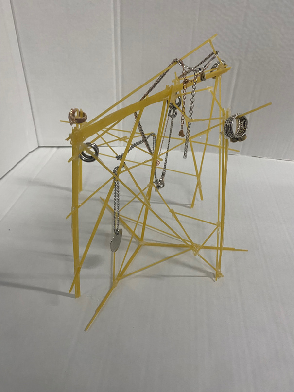
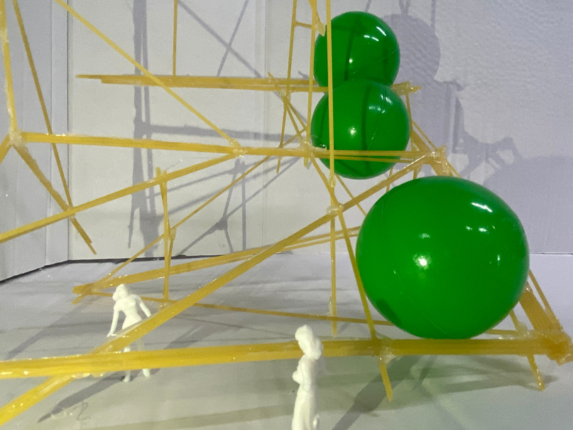
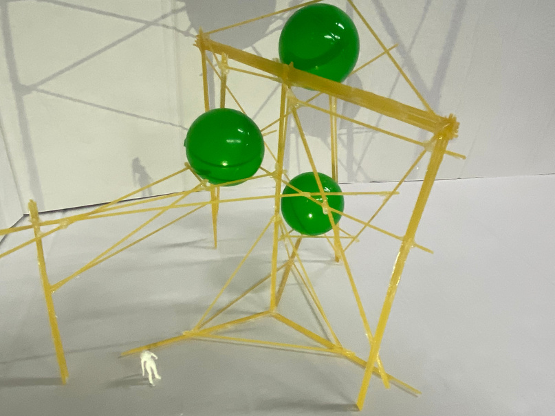
Spaghetti Structures
To come up with possible ideas for how to creatively hold the balls, we underwent different drawing challenges and later drew in the ball. This made me work more freely and explore a range of posssible plans before committing to one design.
Working with spaghetti was a challenging way of making me consider how shapes hold weight and the importance of supports. At times, this was a tedious process. Spaghetti’s brittle nature made it hard to make an initial base without it breaking. However, I persevered and when the initial foundation was made, adding stabilising pieces made the whole sculpture much more stable. The brief asked for us to make sculptures capable of holding at least 3 plastic balls without the touching. My design was able to do this successfully as I intended but also when rotated on its side. The photography to the right demonstraits how I was able to transform the structure in a range of ways. By adding figures, I played with scale and suggested this work could be a larger more architectural project. Adding jewellery gives the viewer an everyday point of reference for scale, so it appears to be its correct size. This was also a way of exploring what other purposes my sculpture could take.
This task has taught me that when I create work, I should try to be less focused on one idealistic outcome. Instead I should work more freely and allow myself to adapt and develop ideas as I produce pieces.
LO3/6
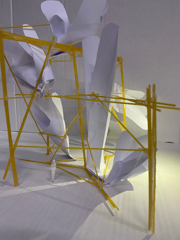
2D to 3D paper task
We started this task off by drawing on a large sheet of paper. The things we drew where gift we have been given. Then we took this paper and cut out most of the blank white areas. This was the basis of our3D work from then on.
The first thing we did was to pin it to a wall and gradually pin more sections. This began to warp the drawing and gave it a new more sculptural look. It was also reminiscent of an installation piece. We next photographed our works in different locations to build on this idea, for example I placed mine around the university so it took on new forms.
This task made me pay attention to perspective as at each new angle or movement of the paper, what could be seen changed massively. For this reason, if I were to do similar agin, I would experiment by drawing on the back of each as well as often in the photographs predominantly plain paper was displayed.
When we had finished photographing this, we were tasked to destroy our work. As I drew my dog as part of the project I felt it would be cyclical to have her destroy the work. This is videoed below.
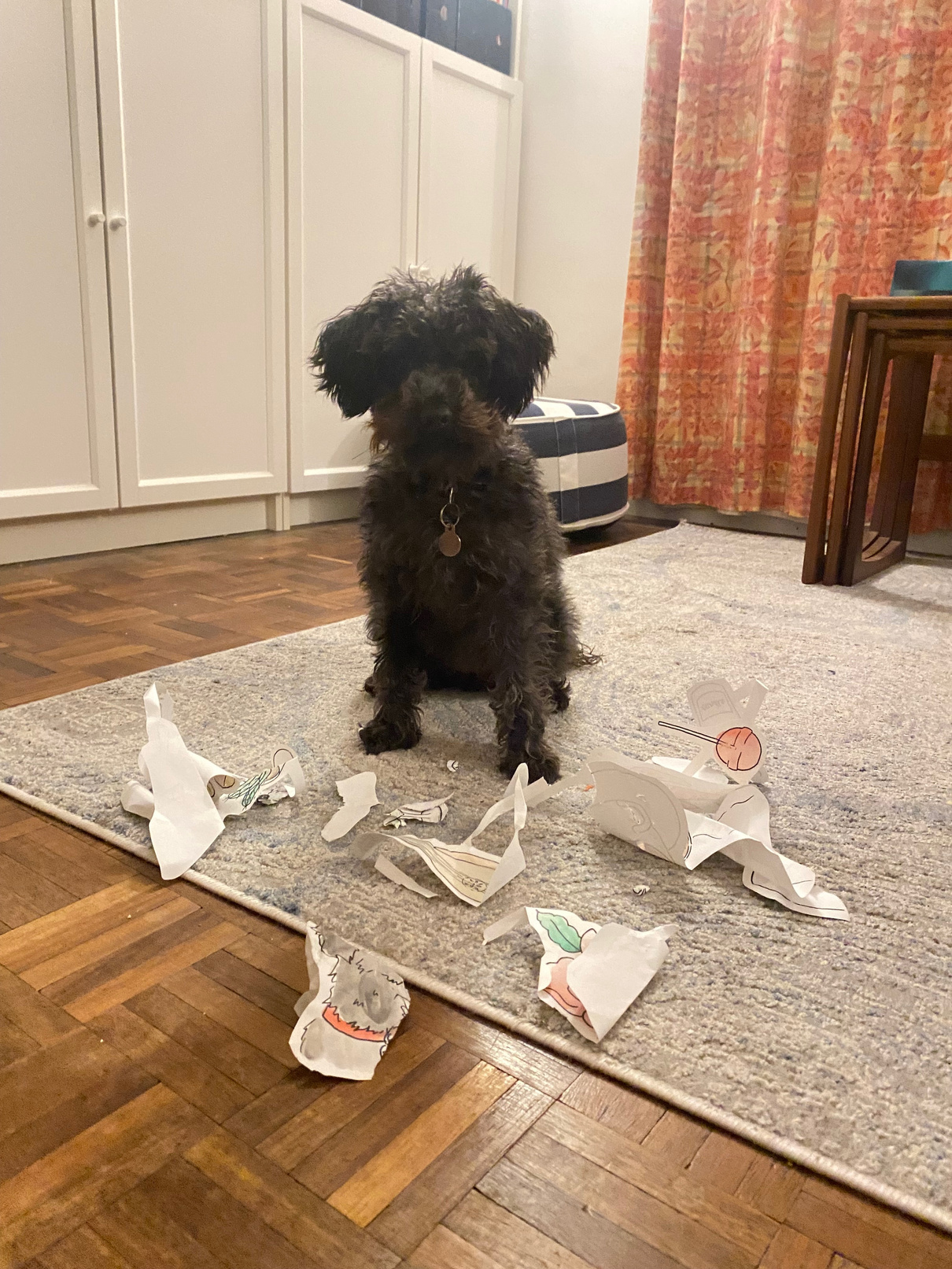

DESTROYING MY WORK
Click Through
(Slideshow)
Video
Please Play
Visual
communication
*
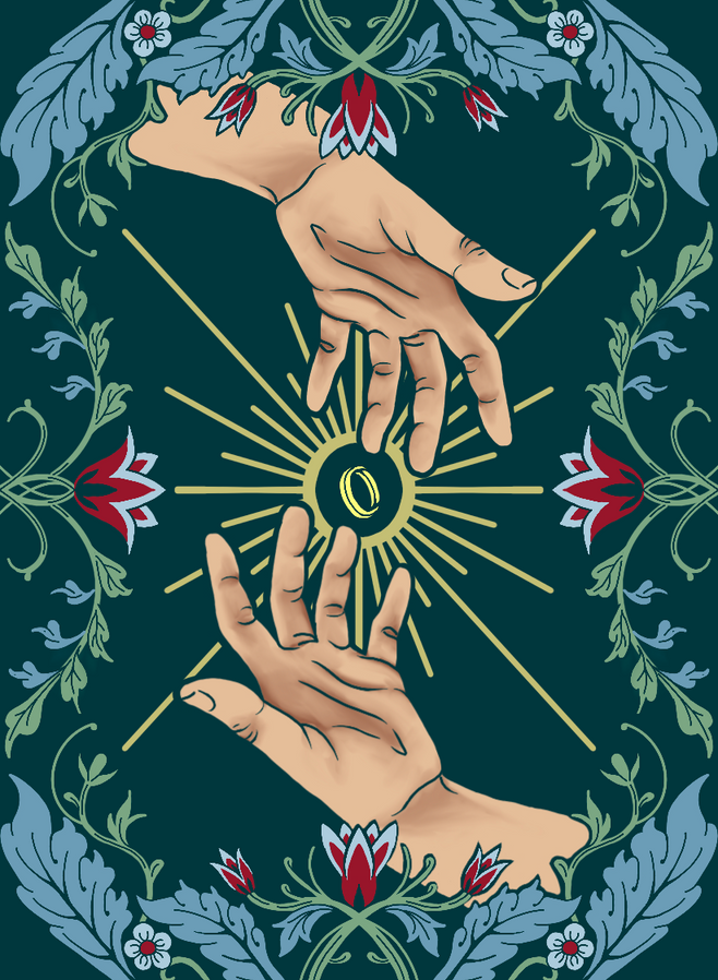
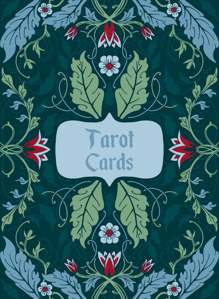
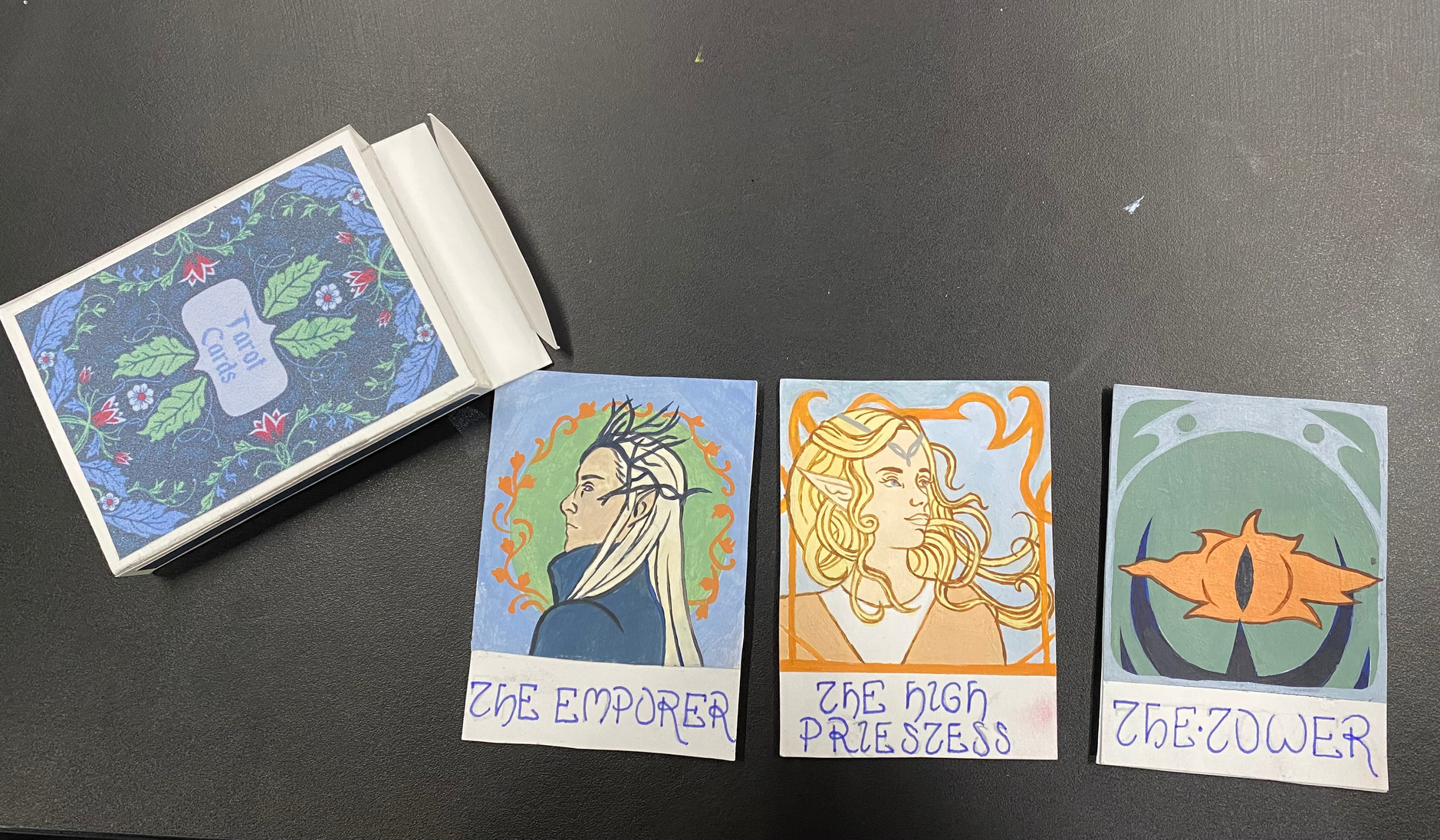
Playing/Tarot Cards
LO2
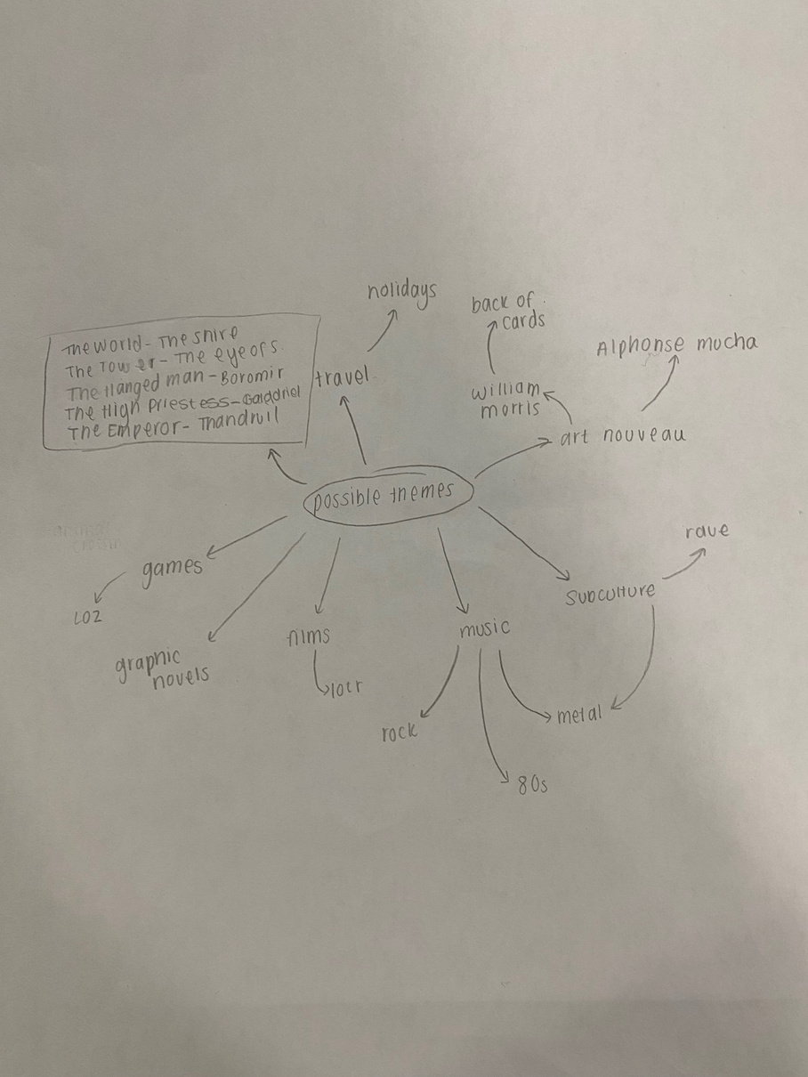
Initial Ideas: Mind Map
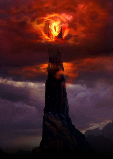
We began researching possible themes for a pack of tarot cards with a mind map of personal interests, then we chose one of these to use as a theme. I also choose to make the cards in an art nouveau style as well as I enjoy the aesthetics of this movement. From the mind map I chose to do my cards based on Lord of the rings (LOTR). After this choice, I began to look at the meanings of certain cards and trying to match them to characters or places from LOTR. For example, The Hanged Man card can mean either sacrifice or wasted sacrifice. I feel this linked well to the character Boromir, who dies protecting other characters from the franchise.
I designed these cards for a young adult or teenage demographic, therefore I chose not to have any bright or overly childish colours in my outcome at this point.
.

LO2
Artist Research & Inspiration
Click Through
(Slideshow)
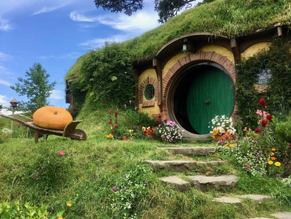
The World: Incompleteness or fulfilment
LO2
Lord of the Rings Moodboard
The Hanged Man: Sacrifice/Martyrdom or needless sacrifice
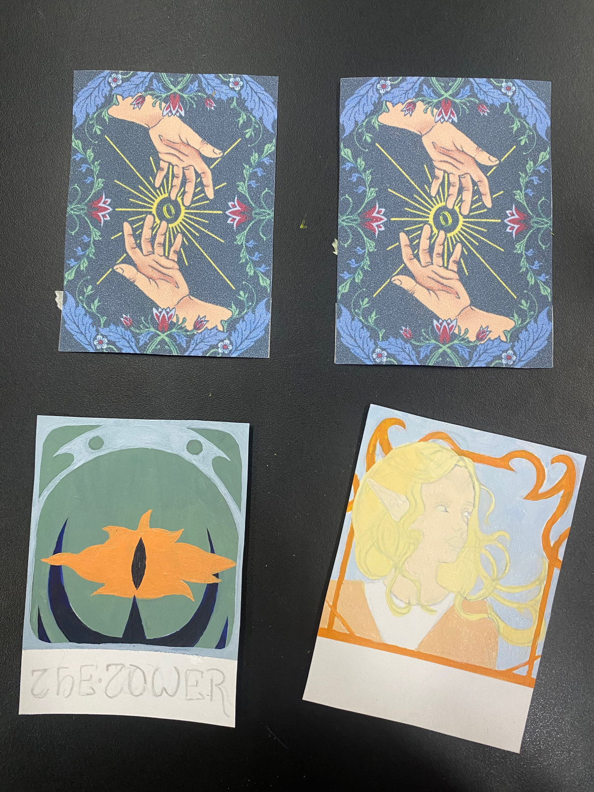
The Tower: Disaster or delayed disaster
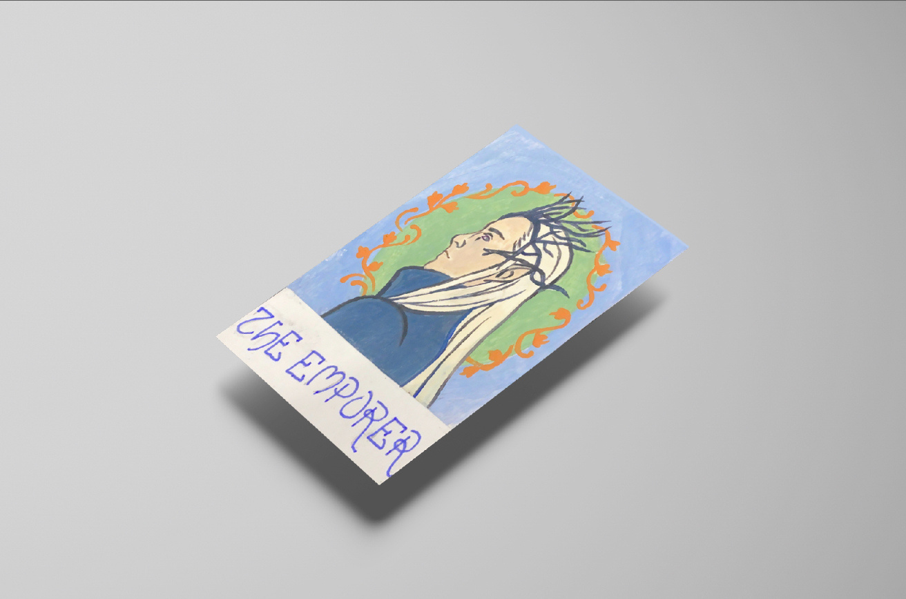
The Emporer: Authority or tyranny
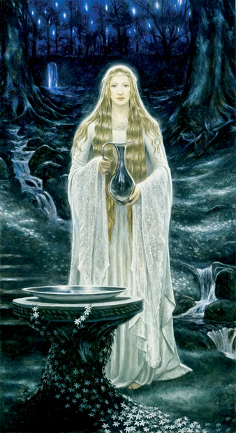
The High Priestess: Intuitive or repressed feelings

*
LO1/3
Back Of The Cards
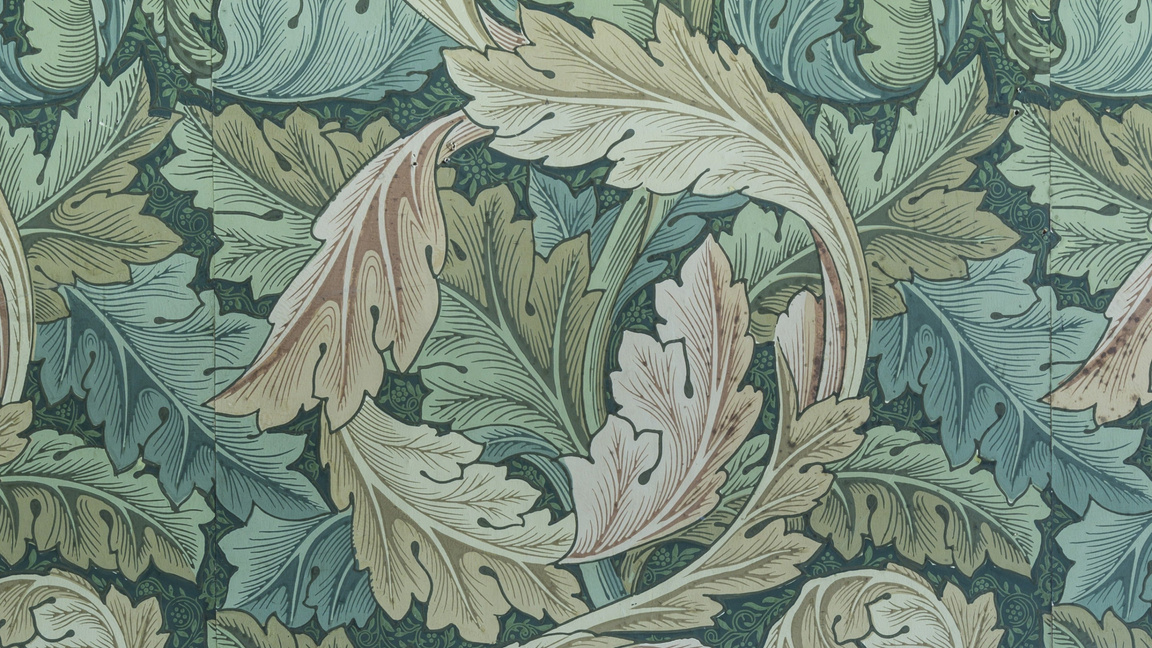
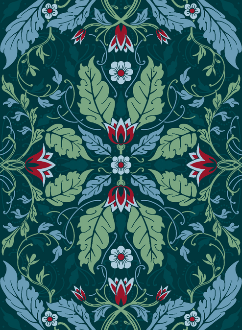
The border of this work was inspired by William Morris’ wallpapers, especially the Acanthus wallpaper at Wightwick Manor and Gardens which is pictured below. I chose to create this digitally so I could easily print of multiple backs of cards at a time, this way of working also allowed me to make small details, keep the work symmetrical and I could easily tie in the hands in by lining parts with the dark green background colour (something much easier to do with a digital selection tool rather than hand mixing a colour match with paint)

*
LO3/4
Box Design
I started with a mock-up of my box idea in copier paper. Initially I drew the leaves and flower design in black & white. When I went to draw the actual design I decided colour would be more impactful. I also make the actual box out of a thicker card so it was able to keep its shape easier. I originally drew the sides of the box to match the dark green background but I changed this to the lighter blue as this showed the designs clearer when printed to the small scale of a card box.


Sides
Front
Back
*
LO5
Fonts
One of the tutorials we where given this week paid special attention to text and fonts. The text on the front of the box is the font “Enchanted Land Font”[32]. I chose this as it was bold enough to draw attention on the front of the box, which has a busy design already, but it also reflected the fantasy nature of Lord Of The Rings. After I finished my cards, I looked for a font that reflected the theme of Art Nouveau. Eventually I chose the hand letter this part as it would match the overall aesthetics of the cards more than most pre-made fonts I found during my research.


Video
Please Play
LO6/7
Creating the Cards
I like the effect that painting the front of the cards gave as it created great consistent tones that are important in an art nouveau style, however this material meant I had to work slower than I would with some other methods. I think the effect it gave is worth this, but in future projects I know I need to assign more time to the painting stage. I painted directly on the other side of the digitally drawn card backs that I printed out. If I were to do this again, I would use higher quality paper as the back was not the clearest print and as such details were lost. This project has helped me to use digital media to create professional looking outcomes, this greatly improved my photoshop skills compared to the first skills week introduction where I encountered a range of technological difficulties. This time, I was able to successfully warp images on different layers. In other projects, I hope to further develop these skills again by using photoshop to add to or refine my handmade works.
FINAL TAROT CARD OUTCOME
LO2
Talk
In Othello’s talk we were told about key themes in his work including masculinity, race and more. Sometimes one series with a unifying theme will adress one of these films in a range of ways, for example in different mediums such as painting and soundscapes: “De’Souza-Hartley’s practice is not confined by medium or genre”[36]. This talk has encouraged me to be more experimental and undergo a range of practices when given a project brief.
Othello de’souza
*
Masterclass Lecture
.
LO7
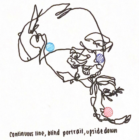
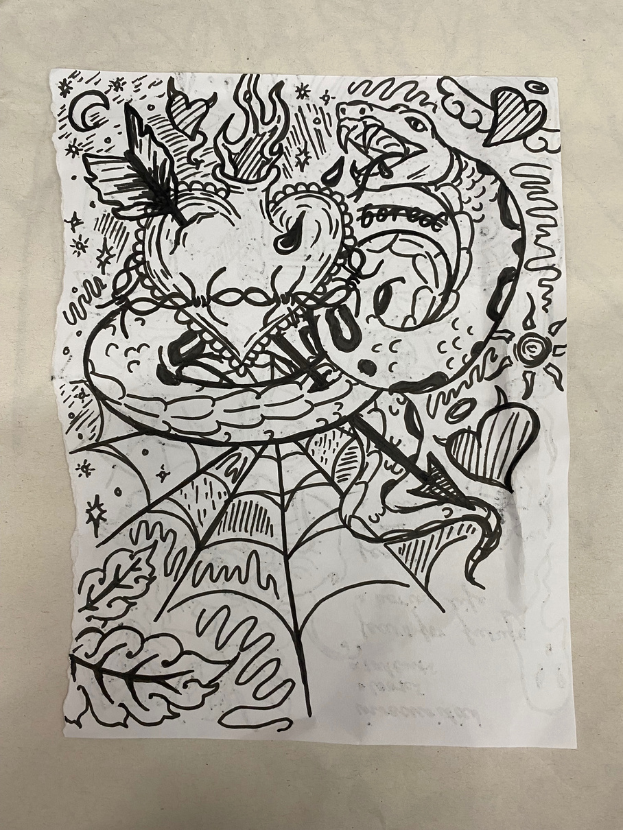
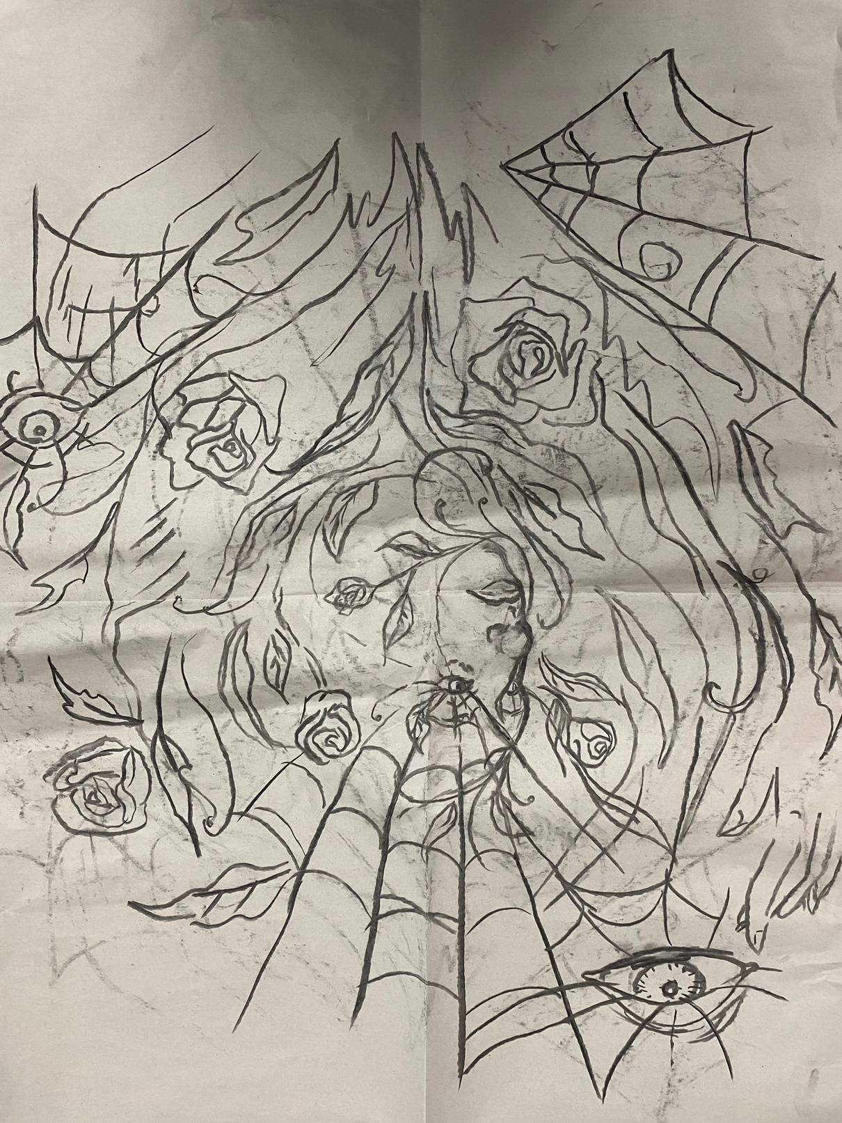
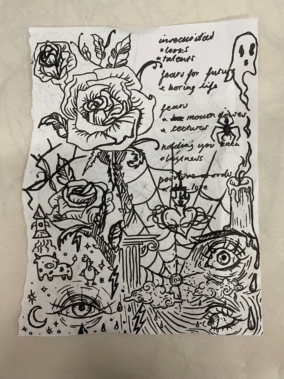
Meditative Drawing Task
We were played music and were told to draw whatever came to mind. This helped me to work without overthinking designs and to improve the speed at which I work and become more creative in composition.
Authenticity Statement
“I confirm that the published work for the Unit 1 assessment of my UAL(Awarding Body) Foundation Diploma is all my own work and does not include any work completed by anyone other than myself (accept where credited) and sources have been appropriately referenced. (Naomi Saunders, 30/10/23) “
Bibliography
- Encyclopedia Britannica. (n.d.). John Heartfield | German artist. [online] Available at: https://www.britannica.com/biography/John-Heartfield. accessed 12/10/23
- John Heartfield Exhibition. (n.d.). Heartfield Political Photomontage ‘Blind and Deaf’ by Turkish Art Critic Meral Bostanci. [online] Available at: https://www.johnheartfield.com/John-Heartfield-Exhibition/about-john-heartfield-photomontages/heartfield-photomontage-dada-political/turkish-political-art-dada-fascist/political-photomontage-bostanci. accessed 12/10/23
- “Whoever Reads Bourgeois Newspapers Becomes Deaf & Blind: Away with These Stultifying Bandages”, John Heartfield 1930, accessed 28/9/23
- “The Worker’s Maypole An Offering for May Day 1894, illustrations by Walter Cranel 2015” Andrea Bowers, accessed 20/10/23
- “The Citizen” 1981-3, Richard Hamilton, accessed 20/10/23
- “Flag” Fred Wilson, 1975, accessed 20/10/23
- “From Seven Rooms of Hospitality”, Siah Armajani 2017, accessed 20/10/23
- Tate (n.d.). ‘The citizen‘, Richard Hamilton, 1981–3. [online] Tate. Available at: https://www.tate.org.uk/art/artworks/hamilton-the-citizen-t03980. accessed 20/10/23
- Queen Mary University of London. (n.d.). Dirty protests - why Irish republican prisoners smeared their cells with faeces to make a political statement during the Troubles. [online] Available at: https://www.qmul.ac.uk/media/news/2021/hss/dirty-protests---why-irish-republican-prisoners-smeared-their-cells-with-faeces-to-make-a-political-statement-during-the-troubles.html. accessed 23/10/23
- ArchDaily. (2022). Design District Canteen / Selgascano. [online] Available at: https://www.archdaily.com/992202/design-district-canteen-selgascano. accessed 27/9/23
- Portrait of John Lennon, Dyslexia Series, Vince Low, accessed 19/9/23
- Found Images Mood Board, all images accessed 28/10/23
- Found Images Mood Board, all images accessed 28/10/23
- Found Images Mood Board, all images accessed 3/10/23
- Found Images Mood Board, all images accessed 3/10/23
- Togo Yeye: Alice wears a dress by Diane Patience Echitey, accessed 5/10/23
- https://www.vogue.com/photovogue/photographers/221797, Diane Patience Echitey, September 2022, accessed 5/10/23
- https://www.taylorangino.com/print, J Brand Series, Taylor Angino, accessed 5/10/23
- https://www.taylorangino.com/print, Faith Lynch Series, Taylor Angino, accessed 5/10/23
- Nil Gallery. (n.d.). Ismail Zaidy - Biography. [online] Available at: https://www.nilgallery.com/artists/52-ismail-zaidy/biography/ Accessed 5/10/23
- Nil Gallery. (n.d.). Ismail Zaidy - Biography. [online] Available at: https://www.nilgallery.com/artists/52-ismail-zaidy/biography/ Accessed 5/10/23
- https://www.matthewjosephs.com Accessed 5/10/23
- https://www.matthewjosephs.com Accessed 5/10/23
- Found Images Mood Board
- https://www.taylorangino.com/print, Taylor Angino
- District 9, 2009
- Farscape, 1999
- Rocky Horror Picture Show, 1975
- https://www.shutterstock.com/video/search/earth-spinning?consentChanged=true&cr=ec&ds_ag=Earth-Spinning&ds_agid=58700004664654257&ds_cid=71700000045483637&ds_eid=700000001391652&gad_source=1&gclid=EAIaIQobChMIsuT7kqWeggMVYfzVCh001gMBEAAYAyAAEgKEFfD_BwE&gclsrc=aw.ds&kw=earth+spinning+stock+footage&pl=PPC_GOO_UK_FT-318611393491&utm_campaign=CO%3DUK_LG%3DEN_BU%3DFTG_AD%3DINV_TS%3Dlggeneric_RG%3DEUAF_AB%3DACQ_CH%3DSEM_OG%3DCONV_PB%3DGoogle&utm_medium=cpc&utm_source=GOOGLE, Earth Spinning, accessed 13/10/23
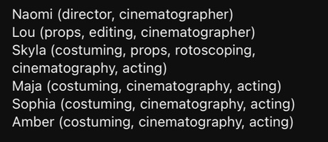
- Group film: Maja W, Skylar R, Lou, Sophia, Amber F
- https://www.britannica.com/biography/Frank-Gehry, accessed 19/10/23
- https://www.fontspace.com/enchanted-land-font-f25784, accessed 25/10/23
- https://www.prague.eu/en/object/places/1643/dancing-house-tancici-dum, accessed 20/10/23
- https://www.archdaily.com/422470/ad-classics-the-guggenheim-museum-bilbao-frank-gehry, accessed 20/10/23
- https://www.lissongallery.com/artists/richard-wentworth, accessed 20/10/23
- https://www.othellodesouzahartley.com/about, accessed 1/11/23
- https://www.cla.purdue.edu/academic/english/theory/narratology/terms/match.html, accessed 13/10/23
- https://www.adobe.com/uk/creativecloud/video/discover/rotoscoping-animation.html#:~:text=In%201915%2C%20animator%20Max%20Fleischer,to%20create%20more%20lifelike%20animation., accessed 13/10/23
- Renny Ramakers. (n.d.). Home. [online] Available at: https://www.rennyramakers.com/, accessed 19/10/23
- Dezeen. (2020). ‘It just happened; there was no plan,’ says Droog co-founder Renny Ramakers. [online] Available at: https://www.dezeen.com/2020/06/26/renny-ramakers-droog-interview-friedman-benda-vdf/. Accessed 19/10/23
- www.lissongallery.com. (n.d.). Ryan Gander | Artists | Lisson Gallery. [online] Available at: https://www.lissongallery.com/artists/ryan-gander. Accessed 19/10/23
- www.saatchigallery.com. (n.d.). Isa Genzken - Artist - Saatchi Gallery. [online] Available at: https://www.saatchigallery.com/artist/isa_genzken. Accesssed 19/10/23
- https://petapixel.com/types-of-lighting-in-portrait-photography/ accessed 12/10/23
- https://unsplash.com/s/photos/dark-photo accessed 12/10/23
- https://www.slrlounge.com/dark-and-moody-photography/ accessed 12/10/23
- Henry David Thoreau Quotes. (n.d.). BrainyQuote.com. from BrainyQuote.com Web site: https://www.brainyquote.com/quotes/henry_david_thoreau_384606 accessed 20/10/23
- https://www.iwm.org.uk/history/what-you-need-to-know-about-the troubles#:~:text=The%20Troubles%20is%20a%20term,Good%20Friday%20Agreement%20in%201998. Accessed 20 Oct 2023
- https://juststopoil.org Accessed 20 Oct 2023
- https://sites.pitt.edu/~dash/grimm031.html , The Girl without Hands, Jacob and Wilhelm Grimm, accessed 4/10/23